What is designer-annotated preference data?
An AI image model produces output that scores well on every standard benchmark. It's sharp, prompt-accurate, and clean. A creative director rejects it on sight. The typography undercuts the visual hierarchy. The color palette drifts off-brand. The layout buries the call to action beneath a visual element that draws the eye away. The model cannot learn from this rejection. The training data that shaped it never captured those distinctions. Designer-annotated preference data closes the gap between technical correctness and design judgment.
TL;DR
A single "which is better" label collapses multiple design criteria into one score, losing per-criterion signal.
Even the largest AI models struggle to match the visual judgment of professional designers.
Designer disagreement at Krippendorff's alpha of 0.25 is signal about brand-specific taste, not annotation error.
Personalized models trained on one designer's labels outperform panel-vote models with 20x more data.
Collecting design preference data requires per-criterion interfaces and gated expert onboarding, not crowdwork.
What designer-annotated preference data is
Designer-annotated preference data captures training signals from professional designers who assess AI-generated visual work across multiple independent criteria. The word "independent" is central. A designer rating a layout doesn't produce one score for the image. They rate typography separately from color harmony, visual hierarchy separately from brief fidelity, spatial composition separately from tone.
The multi-dimensional structure matters because "preference" in a design context is not a single question with a single answer. A creative director might look at two generated ads and choose one. That choice compresses dozens of distinct assessments into a single output. The model learns "A beats B" without learning why A's typography works. It also misses why B's color palette failed for that specific layout. The signal collapses.
TASTE research shows that designers judge along several distinct axes: typography, visual hierarchy, color harmony, layout, and brief fidelity. A single composite label averages over those axes and loses per-axis signal. The "designer-annotated" qualifier carries equal weight. These assessments come from trained aesthetic reasoning, not general crowd opinion.
Why photographic preference data doesn't transfer to graphic design
Most training for image preference models relies on datasets built from photographic output. Models like HPSv2 and Pick-a-Pic were designed to answer a photographic question: does this image look good and match the prompt? Questions about prompt accuracy work for photography. They don't capture the specific requirements of graphic design.
Photorealism is not composition
Design quality depends on spatial relationships, compositional balance, and hierarchical organization, all of which reflect design intent rather than photographic fidelity. A layout can be sharp and prompt-accurate while burying the call to action. A color palette can be vibrant while clashing with a brand's established visual language. DesignSense research confirms the gap: existing preference models are built around photorealistic content, not the spatial relationships that govern layout quality.
Scaling models doesn't close the gap
Larger Vision-Language Models don't close this gap either. The TASTE benchmark found that no pre-trained system exceeds 0.55 macro agreement with the five-designer majority. Scaling from 33B to 333B parameters doesn't improve accuracy. It trades one error type for another (position bias versus content sensitivity) while staying equally far from designer judgment.
The performance gap is not a data-volume problem. You cannot fix a misaligned training distribution by adding more data from the same distribution. The gap is structural. Photographic preference models were never exposed to the criteria designers use, so no amount of scale teaches them to apply those criteria reliably.
The criteria designers use
The TASTE dataset used two disjoint cohorts of five professional designers each, rating outputs from four text-to-image models across nine criteria. Every criterion rejected the random-rater null, confirming that designers aren't guessing. Their feedback is consistent within each dimension.
The nine criteria cover:
Typography: whether font choices, weight, and size serve the design's communicative goal
Visual hierarchy: whether the arrangement of elements guides the eye to what matters
Color harmony: whether the palette is coherent and appropriate for the brief
Layout: whether spatial organization is balanced and purposeful
Brief fidelity: whether the output addresses what the prompt asked for
Aesthetics: whether the overall composition reads as intentional and polished
Spatial balance: how mass and whitespace relate across the composition
Tone: whether the visual mood matches the intended context
Style: whether the visual treatment matches the intended stylistic register
Each of these can fail independently. A design can have strong color harmony and broken visual hierarchy simultaneously. A single aggregate score treats those failures as linked, or lets one strength mask the other. DesignSense (arXiv, 2026) found that reward models trained on layout-specific pairs improve generator win rates by 3 percent and inference-time scaling by 3.6 percent.
Designer disagreement is signal, not noise
The instinct in preference data collection is to majority-vote disagreements away. More annotators, cleaner ground truth. DesignPref research puts a number on that disagreement: professional designers show a Krippendorff's alpha of 0.25 across a panel. That figure doesn't indicate unreliable annotators. It means design taste diverges along aesthetic dimensions: a preference for minimalism versus visual density, a typographic sensibility, a brand-specific treatment of negative space. Those divergences aren't errors. They're the distinctions that make designer judgment valuable.
Research on annotator disagreement (arXiv, 2026) found that disagreements in preference datasets stem from ten distinct categories, not simple noise. Aesthetic taste accounts for 14 to 22 percent of them in general preference datasets, a figure likely higher in design-specific contexts. Majority voting averages that specificity away.
The implication: a personalized model trained on a single well-calibrated designer's labels consistently outperforms aggregated baseline models, even with 20 times fewer examples. For brand-aligned generative models, the panel-vote approach may produce weaker training signal than a single designer matched to the brand's aesthetic. Disagreement is information about the design space. The task is to model it, not suppress it.
How to collect designer preference data in a production pipeline
Three controls keep a design preference dataset usable: who annotates, how the interface is structured, and how quality is maintained over time.
Expert annotator selection
Crowdworkers can't provide designer-annotated preference data. Criteria like typographic hierarchy, compositional balance, and brief fidelity require aesthetic judgment built through professional design practice, not image exposure. The annotators need to be designers whose expertise matches the visual domain: brand design, editorial layout, packaging, UI, or motion. A UX designer will judge typographic hierarchy differently than a brand designer, and both differ from a motion designer.
HumanSignal's design data services use a global network of professional artists and designers. The service covers preference and aesthetic ranking, style-specific image training data, and multimodal critique across image, video, and audio. The annotator's domain expertise gets matched to the specific design criteria being rated.
Per-criterion labeling interfaces
An annotation interface with a single "which is better" input will produce aggregate preference data regardless of how expert your annotators are. The interface structure dictates what signal can be collected. Per-criterion assessment requires separate inputs for each dimension (typography rated independently of layout, color harmony independently of brief fidelity). Annotators cannot resolve the task by picking an overall winner when each criterion has its own interface.
Separated criteria capture the specific reasoning behind a preference. When designers provide rationales for their ratings, the training signal carries contextual information that pure rankings can't. A rating plus a comment explaining that the typographic weight undercuts the hierarchy is more useful than the rating alone.
Gated onboarding and continuous calibration
Expert credentials don't guarantee that a designer will annotate consistently. A professional might interpret "visual hierarchy" differently than the project rubric defines it, particularly on edge cases. Treat onboarding as a quality control problem rather than a training one. Ground-truth tasks gate production access: a designer must reach a minimum agreement score before contributing to the live dataset. Known-answer tasks mixed into the production stream catch calibration drift before it spreads through a labeling run.
For design preference data specifically, calibration matters more than volume. Calibrated data from matched designers trains a better reward model than more data from designers with different aesthetic assumptions.
What teams building AI on design tasks should expect
Designer-annotated preference data requires continuous refreshing. The reward model trained on it reflects the judgments of a defined group of designers against a defined set of model outputs. As the generative model improves, earlier examples may no longer represent the discriminating cases it needs to learn from.
By 2029, explicitly modeled business decisions will be five times more trusted than ungoverned ones, according to Gartner's 2026 trends report. Design preference pipelines fit that frame directly. A governed, repeatable collection process produces judgments that are explainable and auditable. When a creative director approves model output, the preference data behind that approval is traceable. Each cycle builds a model that learns what this brand considers correct, rather than averaging what designers generally prefer.
When the rejection becomes learnable
The creative director's rejection couldn't be reduced to a single label. The typography was wrong. The layout buried the call to action. The color palette drifted off-brand. Three distinct failures, each worth diagnosing on its own. A pipeline that captures those distinctions separately converts the rejection into learnable signal, and designer disagreements get modeled rather than averaged away. Taste, properly collected across independent criteria by calibrated experts, is the training signal that makes AI output identifiable as the brand's.
Related Content
-
Ways to do document annotation in Label Studio
Learn how to configure XML architectures for text spans, multi-page image conversions, and native PDFs to extract accurate ML training data.
-
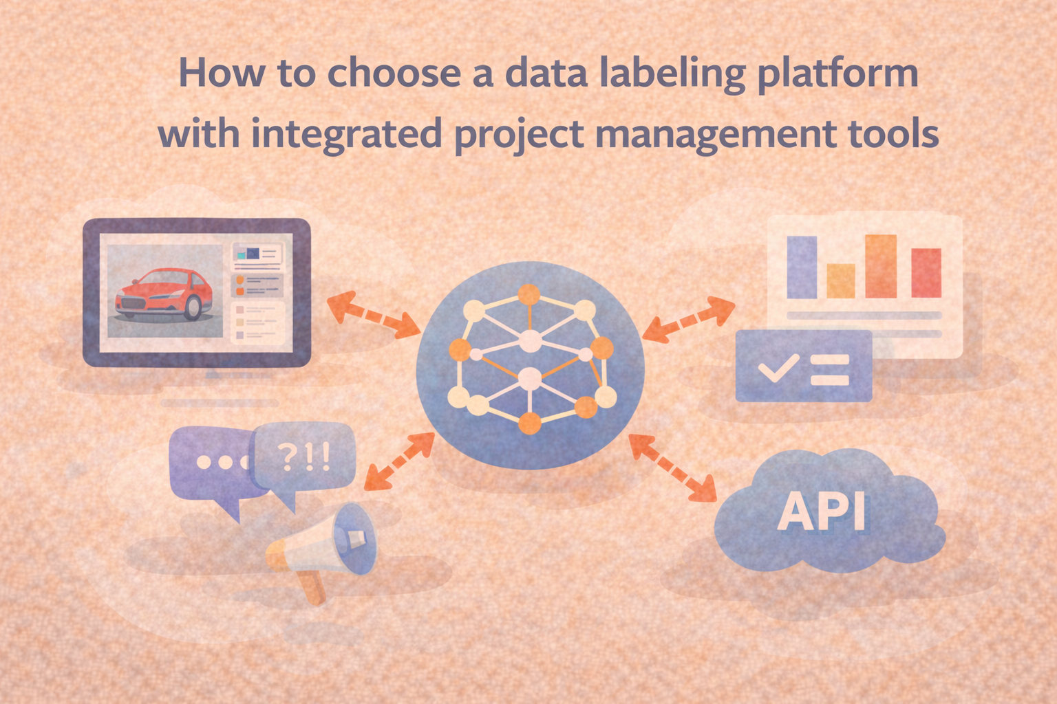
How to choose a data labeling platform with integrated project management tools
A practical guide to evaluating labeling platforms that help teams manage projects, coordinate reviewers, and maintain quality as workloads grow.
-
What is data quality assurance for AI?
Data quality assurance for AI is a continuous workflow, not a preprocessing step. Learn the failure modes, quality dimensions, and remediation loops that matter.
-

How to Choose the Right Data Labeling Tool for Your ML Projects
The right data labeling tool can make or break your ML workflow. In this guide, we break down what to look for—from multi-modal support to quality assurance workflows—and where most tools fall short. Whether you're labeling your first dataset or managing enterprise-scale operations, learn how to choose a platform that scales with your team.
-
When generalist annotators aren't enough
Generalist annotators don't fail because they lack expertise. They fail without the right workflow. Learn the tiered model that changes that.
-

Scaling AI Starts with Smarter Data Labeling Jobs
Data labeling is no longer a side task, it’s a strategic function. In this post, we break down the five essential data labeling jobs that drive successful AI projects, from precision annotators to workflow engineers. Learn how the best teams structure their work, enforce quality, and future-proof their pipelines.
-
How to shortlist annotation vendors for your use case
A technical framework for shortlisting annotation vendors: task mapping, four production-fit criteria, pilot design, and data portability before you sign.
-
How to audit the language annotations in your VLA dataset
Learn how to audit VLA dataset language annotations with four structured checks: instruction diversity, grounding, temporal alignment, and density.
-
Human data vs. synthetic data: What's the difference?
Learn the real difference between human and synthetic data, where each breaks down, and how the 10 percent threshold rule determines whether your model holds up in production.
-
How to run a pilot before committing to an annotation vendor
Learn a five-phase annotation vendor pilot framework that tests process, scalability, and contracts, not just label quality, before you sign.
-
Should you build a data collection team or outsource it?
Build vs. outsource your data collection team? Use these three criteria (data complexity, time-to-scale, and domain expertise) to make the right call.
-
Expert annotation uses credentialed specialists, not crowd workers, to label AI training data. Learn how it works, why generalist labeling fails, and how to run the program.
-
Crowdsourced vs. managed labeling: which fits your project?
Discover the three factors that actually determine whether crowdsourced or managed labeling fits your project, beyond the standard scale vs. quality framing.
-

How to find data annotation services that handle both image and audio datasets?
This guide explains what to look for when choosing data annotation services that can reliably handle both image and audio data within the same workflow.
-
How data labeling pricing models compare
Unit costs don't tell the full story. Learn how automation maturity, domain expertise, and ownership model determine your real data labeling spend.
-
How to judge the quality of a vendor's preference data
Learn how to evaluate vendor preference data quality for RLHF using four criteria: annotator qualifications, IAA scores, task coverage, and QA workflow transparency.
-
How to collect preference data for creative and design models
Learn how to collect high-quality preference data for creative AI models using multi-attribute rubrics, structured annotation interfaces, and disagreement routing.
-
Why taste is a data problem: labeling for subjective quality
Subjective quality labeling fails when teams treat annotator disagreement as noise. Learn why disagreement is the signal, and how to measure it.
-
This guide is your starting point for understanding the people, tools, and processes behind high-quality data labeling. Whether you're new to the space or scaling a production pipeline, you’ll find practical insights on workflows, roles, QA strategies, and platform selection, all in one place.
-
What does "human data" actually mean?
"Human data" means three different things across three industries. Here's what it means in AI development, and why the supply is shrinking.
-
What to look for in a data collection partner
Four criteria separate data collection partners that improve model performance from those that delay it. Here's the evaluation framework to use before you sign.
-
Buy an existing speech dataset or commission a custom one?
Choosing a speech dataset? Compare the hidden costs of off-the-shelf corpora against commissioning custom data using this practical decision framework.
-
Top 6 Data Labeling Challenges (and How to Overcome Them)
Data labeling is the backbone of every successful ML project—but it’s also where teams hit the most roadblocks. From quality control to scaling across data types, this post breaks down the six most common challenges and offers practical solutions to help you label smarter, faster, and with more confidence.
-
How providers source genuine subject-matter experts
Learn the three criteria data providers use to source SMEs who can anchor AI model quality, beyond résumé credentials and job titles.
-
How to choose a human data provider
Stop choosing human data providers by workforce size. Use this rubric covering domain fit, quality control, and workflow integration to find the right provider.